A formula for responsive font-size
165 points by jamesfisher 1 year ago | 108 comments- mleonhard 1 year agoNo! If you mess with the font size, you make your page hard to read for people who adjust their font size in their browser. They set their font size very carefully, to the smallest size they can comfortably read. Your site had better not change that.
Medium.com is the worst offender. Their font size is small and they disable zooming on mobile!
- tobr 1 year agoI would expect two large groups of user behavior:
1. People who never adjust font size.
2. People who regularly adjust font size as needed.
The first group is helped by a reasonable responsive font size. The second group isn't hindered by it.
Is there really a significant group of people who carefully set their preset font size, but then do not adjust it as needed when they visit a page? It seems unlikely to me. Even if all webpages used your defaults, there’s still no one-size-fits-all preset to pick, since typeface, weight, layout, leading, colors and many other things also impact readability. The tool to take control of all of that is reader mode, which is a great option when a website has screwed up its typography.
- Karellen 1 year ago> I would expect two large groups of user behavior:
I think you're missing:
3. People who set the font size once, when they configure their browser, to their preferred font size and expect, for some weird reason, that this will be respected!
> The tool to take control of all of that is reader mode, which is a great option when a website has screwed up its typography.
That would be great, if there wasn't a huge correlation between websites that screw up their typography, and websites that use an ungodly mess of nested `div`s and javascript-based content rendering that breaks reader mode.
- marcosdumay 1 year agoOn Firefox there's a preferred, minimum and maximum sizes. If you want sites to respect it, you set the minimum, otherwise it's a suggestion.
- dspillett 1 year agoThat third group is small enough that if it is impractical to properly support all three, they are the ones that will be ignored first.
- marcosdumay 1 year ago
- navane 1 year agoI set the text size on my mobile browser. You'll understand as you get older and your devices keep getting more pixels.
- tobr 1 year agoI do too, and I’m in group #2. Are you saying you’re not?
- tobr 1 year ago
- account42 1 year agoAll CSS font sizes are already responsive because CSS pixels are an abstract concept. Adding your own hacks on top of that instead of respecting system settings is counter-productive.
- Karellen 1 year ago
- stefanfisk 1 year agoThis method uses the root font size as the base and therefore scales with the user's custom setting.
- Karellen 1 year agoThe point of the user's custom setting is that you don't need to scale with it. The user's custom setting is the font size they want! That's why they set it.
If the user wants a different root font size, they'll set it themselves.
- jrwoodruff 1 year agoIf every site used the same font, maybe. But different font faces vary in readability at the same size. Also, we still have to set sizes for things like titles, subtitles and other elements to create a hierarchy on the page.
'Don't resize my fonts' is such a narrow view of whole range of design considerations.
- bryanrasmussen 1 year agofont size needs to scale because font size can also affect contrast, unless the user is setting custom font size per site it will not be adequate for the user to set the custom font size for all potential situations.
- tiagod 1 year agoThe vast majority of users don't know how to adjust the font-size.
- p_l 1 year agoUnfortunately, while making a site, I can't query for "does the user set special preferences" in CSS.
I use somewhat similar formula in one project to create a common baseline font size that 1) does not break with viewport size changes 2) remain legible for baseline user 3) gives good base value to scale UI elements by rem/em units.
Of course it's also a project where the user does not have a chance to mess with font size anyway for the main user, but I'd reuse the formula elsewhere.
Wish I could query the browser if the user has specific preferences, just like with "Dark mode"
- jrwoodruff 1 year ago
- 1 year ago
- Karellen 1 year ago
- tiagod 1 year agoFor me, HN is one of the hardest to read on default zoom.
- andy_ppp 1 year agoIt's a real shame the site is never improved due to the captive market and lack of need to make things better. I am constantly downvoting on mobile when I mean to be upvoting for example, surely they could just make the clickable area bigger.
- yccs27 1 year agoI also sometimes wish this site got an overhaul, but then I look at the new Reddit layout and feel glad HN hasn't changed like that.
- DHPersonal 1 year agoI use a Safari extension to add my own CSS and edited a Stylish package that already existed to update the design a bit. On iOS and iPadOS I use Hack. https://apps.apple.com/us/app/hack-for-hacker-news-reader/id...
- bee_rider 1 year agoThat’s interesting; this seems like one of the better mobile sites to me. I mean it is just a column of text. I don’t really care that much if I hit the wrong voting button, though. I’m just one little signal, if my inputs are slightly stochastic it shouldn’t matter too much. If I really love a comment I can zoom in a bit to hit the arrows.
- yccs27 1 year ago
- account42 1 year agoThen change your DPI scaling factor to match your display size and viewing conditions. HN has a perfectly reasonable font size.
- dns_snek 1 year agoThere are exactly 2 websites where I feel like I need to increase my front size, HN (140%, no less) and old.reddit.com. Every other website I use looks fine.
And I'm not changing the font size on every website I visit for the rest of my life just so that HN can display properly at 100% zoom.
- Macha 1 year agoIt's 9pt, most recommendations I see are between 14-16 for body text. I usually have HN on 130% in my browser.
- tiagod 1 year agoBrowsers have 16px font as the default. HN is set to half.
- elevatedastalt 1 year ago"just change your settings for your whole monitor for every site you visit because HN has the _perfectly reasonable_ font-size of 9pt."
- dns_snek 1 year ago
- andy_ppp 1 year ago
- jskherman 1 year agoLaughs in pinch to zoom which works for zooming into images as well. I just really hate those websites that disable this and the regular zoom.
- account42 1 year agoI actually liked it more when browser zoom affected only the font size and images were left 1:1 - for a normal Desktop usage anyway.
- bee_rider 1 year agoBrowsers should definitely support both, they are very different features.
- bobbylarrybobby 1 year agoI know that Safari has two zoom modes, one which zooms the whole page and one which zooms just the text, leaving everything else intact.
- bee_rider 1 year ago
- account42 1 year ago
- sitharus 1 year agoIf only CSS supplied some sensible keywords based on the user's preferences, so you could just ask for say a medium, large, or x-large font.
Of course CSS actually does. I've found using font size keyword and rem units can make a UI that scales with user preferences quite possible. Not _easy_ of course, but possible.
- oneeyedpigeon 1 year agoActually, Medium—the app, at least—does have an option under "Display settings" that lets you switch between two font sizes that are almost imperceptibly different...
- CGamesPlay 1 year agoFull-page zoom won already. Browsers all make it very difficult to even scale the font size without zooming the page (Firefox is the easiest, with the setting buried in a submenu as a toggle). And frankly, scaling just the fonts but leaving the rest of the layout is a bad experience: scaling just the font size often breaks the layout, particularly around interactive controls like buttons and tabs. There are two good paths to accessibility here: full-page zoom, and reader mode.
- RespectYourself 1 year ago[dead]
- tobr 1 year ago
- stevetron 1 year agoI have found myself in my own private war against web sites over text viewability. Gievn that I am a longtime-coder, and longtime-electronics engineer, I had a life-altering experience a few years ago: as I was laying out a new circuit board design via CAD for a longtime client, a board which I would also have to write all the code for, my eyesight went all-goofy <technical term?>. I had to depend on family members to get me an emergency admission to an eye clinic, where I learned I had a detached-retina in one eye, was told it must hurt, and they didn't have anyone on-staff that could fix it. A few years later, and I have my vision blocked in that same eye due to a cataract, they won't do surgery becuase I'm 'allergic to lasers' and I need to shift to audio books. Huh. No, here's what I need from web pages and web browsers: an end to de-emphasised background comments that appear as light-gray on white background, and a quick button that let's me view everything in undecorated font Libre Sans (Libre mono for code), Boldface, and 14-pixel. The boldface is a huge sticking point, and I really need it. And nobody supports it :( My eyesight is like viewing everything through a 'snowstorm whiteout'. The thin strokes of non-Boldface are nearly invisible, and size-alone doesn't quite fix it enough. Then there are the web site that insist on havign a hard-lock on low-contrasty themes......they seem to feel their precious theme to be more important than the word.
- yetanother12345 1 year agoIn your browser of choice, install the "Stylus" plugin. This is a plugin that will let you write custom CSS styles for any and all page(s). If your browser of choice does not have the exact "Stylus" plugin it will have a plugin of another (similar) name that will do the identical task.
As it seems from your post that you may not be extremely familiar with CSS, here is a ruleset that will do something close to what you wish. Font is set to 26px, not 14. You can easily change that.
Make it valid for "Everything" and it will be valid for everything but those sites that are extremely convoluted.
*, html, body, section, article, div, span, p, i, b, strong { font-family: "Libre Sans" arial, helvetica, sans, sans-serif !important; font-size: 26px !important; font-weight: bold; line-height: 1.5em !important; background-color: white; color: black; } pre, code { font-family: "Libre Mono", Courier, monotype !important; } a { text-decoration: underline; }- yetanother12345 1 year agoAdded: Here is the ruleset I use for Hacker News specifically
    * {
        font-size: 23px;
        line-height: 1.5em
    }
    a {
        text-decoration: underline;
    }
- yetanother12345 1 year ago
- bee_rider 1 year agoWebsites should be designed better, but it is 2024, that ship has sailed I think.
The Dark Reader addon for Firefox is somewhat poorly named, it seems to be a pretty solid overall website customization tool. It can, for example:
* force websites into light mode
* change backgrounds to plain white and text to plain black
* apply tints in general
* force font line width changes.
Might be worth a glance. I have pretty good vision but I just use it because the way the internet is supposed to work is: send me text, I’ll render it however I want. This lets me ignore more meddling by designers.
- gopher_space 1 year agoI've been asking myself what I want out of visiting particular sites and what I need to get it. How far do I need to move from the command line to fulfill my goal?
At the browser level I've found myself wanting to reorganize layout quite a bit, and am starting to think about templating from a user perspective beyond light/dark theme. What assumptions am I making about intent in my work? How can I provide flexibility and when should I step back and just link a csv dump?
I think my ideal modern browser looks more like a crawler. Display of info loosely coupled to site content. All of the scripts I'd actually want to run pulled down on my side from public repos.
- medstrom 1 year agoYes! The day I made my website serve a "posts.atom" file was the day I realized:
The posts.atom file has all my actual content.
What is the rest of my website for? Somehow I was tricked into writing it, but it's essentially a feed reader for a single feed.
Why can't I just serve a posts.atom and trust Firefox to know what to do with it? It already has a Reader mode.
- medstrom 1 year ago
- youssefabdelm 1 year agoIf you're on Mac, I recommend the Arc Browser, and using their Boost to adjust sites with custom css with the font + bold specification you want. Or a chrome extension, but I'm sure you've already found a similar solution and it's annoying to just have to re-do that everytime.
I wonder if there are custom CSS chrome extensions that allow you to apply a font to all sites not just one.
- adhamsalama 1 year agoDoes the browser reader mode help?
- RespectYourself 1 year ago[dead]
- yetanother12345 1 year ago
- mariocesar 1 year agoI like how it behaves on desktop, but I don't like making it "responsive" on mobile.
We can fix that :D
"pointer" refers to the way a user interacts with a device's screen, either using a precise pointing device like a mouse (fine pointer) or a less precise one like a finger on a touchscreen (coarse pointer).:root { font-size: 1rem; } @media (pointer: fine) { :root { font-size: calc(1rem + 0.25vw); } } @media (pointer: coarse) { :root { font-size: 1.25rem; } }- account42 1 year agoLet's actually fix it:
Done. Don't mess with the user's preferred font size. If you think some browsers have bad defaults, campaing to have them fixed instead of hardcoding incompatible hacks for each website.:root { font-size: 1rem; }- tln 1 year agoI'm not so sure..
There are good reasons to use different font sizes for body text depending on purpose. Hacker News' small fonts fit more comments on the page. A documentation site may benefit from fitting more text on the page. A spreadsheet benefits from even smaller text. The article is easier to read with larger fonts. I tried the article with your rule, it's just not as nice.
Then I changed around my "preferred font size" (chrome://settings/fonts -> Font Size). Blog responds just fine to it. Ironically many, many, many sites don't. It's actually so useless in general to change your default font size that browsers have a much more useful way of letting users have small or large text -- zoom levels.
- bee_rider 1 year agoAll of your examples benefitted from smaller text. And the caveat is always that it has the be big enough to read. Therefore, just let the user set the size, they can set it to the smallest size they can read.
- bee_rider 1 year ago
- 1 year ago
- tln 1 year ago
- account42 1 year ago
- lifthrasiir 1 year agoPlease, please please have reasonable bounds around that if you do want to use a responsive font-size. `clamp(10px, 1rem + 0.25vw, 60px)` (say) doesn't harm anyone else.
- runxel 1 year agoThere are some worst offenders who chose the fontsize based on the size of the viewports... and it get's ludicrous big at my work, where I have an ultra wide curved monitor.
Everybody please clamp!
- WorldMaker 1 year agoIt's definitely a fascinating game to try websites Full Screen on an ultra wide. I definitely tend to stick to FancyZones for most browser windows to get "normal" breakpoints, but every now and then it's fun to play with sites and see which ones tested extremes in responsiveness.
I get a lot of flak that my blog [0] scrolls horizontally by default when JS is enabled, because that is intentionally weird, but it's one of the only websites I know of that is "readable like a newspaper" when full screen on an ultra-wide monitor. Some posts you can read the entire article at full screen on an ultra-wide with no scrolling at all. I'm proud of that and I like that for my own enjoyment, even if few others appreciate it.
- WorldMaker 1 year ago
- runxel 1 year ago
- youngtaff 1 year agoReally need to adjust more than just the font size, line height, grid spacing etc all need adjusting too
https://utopia.fyi/ is good for these calculations
- qingcharles 1 year agoI used Utopia as the baseline for my sites; though I hadn't previously encountered people who had force-changed their font-size per site.
- andrei_says_ 1 year agoI also came here to recommend Utopia.fyi. An incredible solution done right. Use it on all my projects - for don’t size, typographic scale, and spacing.
- zelphirkalt 1 year agoFunny typo. For a moment I thought the link would be about how not to size things on websites.
- andrei_says_ 1 year agoYes, I noticed the autocorrect but it was too late. Thought the context was sufficient to expose it as a typo.
“…for font size, typographic scale, and spacing.”
- andrei_says_ 1 year ago
- zelphirkalt 1 year ago
- 1 year ago
- qingcharles 1 year ago
- Ennea 1 year agoThis is going to make text very large whenever somebody with an ultrawide monitor decides to maximize their browser window.
- jotaen 1 year agoAlthough not exactly ultra-wide, on my 27" screen, the font-size with maximised window (2500px horizontally) would compute to ~22px for the submitted website. While that’s noticeable bigger compared to a narrow view port, I’m not sure that would qualify as “very large”. To me, it looks alright.
The main container’s width on their website also doesn’t scale infinitely, so on a very wide screen you’d have a lot of blank space on both sides.
That being said, it might still be reasonable to set a break point (or use CSS clamps) and prevent further font-size growth beyond a certain point.
- alkonaut 1 year agoYes how is the viewport size really relevant? A sensible site would have a max column width for any paragraph. So if I have a 4000px wide viewport and view a 500px wide column of text, it has to be the same size as the 500px column of text also if the browser window is just 1000px?
- jotaen 1 year ago
- xz18r 1 year agoIronically, the font is too large for the table to fit on the screen, introducing horizontal scroll on this mobile page which I’m sure isn’t best practice. (I’m viewing this page on an iPhone 15)
- zelphirkalt 1 year agoThat in itself might mean, that a table is not the right way in this case.
- planede 1 year agoI think a table can be alright, there is only so much you can do. It could be fine tuned though to only require horizontal scrolling on the table and not the whole web page. Maybe anchor the first row and column if you want to be fancy.
- planede 1 year ago
- zelphirkalt 1 year ago
- ceving 1 year agoSilly idea! A font size must depend on the vision of the reader.
- Cloudef 1 year agoIsn't the whole point of em that you don't have to do this?
- stefanfisk 1 year agohow would one use em to implement something like this?
- Cloudef 1 year ago1em is your base text size (what your content should use), >1, <1 when you want larger or smaller text, point being you don't dynamically adjust and break the users font size configuration.
For example comparison with the OP's site:
- dynamic on : https://files.catbox.moe/qwa2az.png
- dynamic off: https://files.catbox.moe/glu3ud.png
- stefanfisk 1 year agoDon’t you mean rem? If you use em like that you have to make sure that you don’t multiply your font size more than once when nesting elements.
- stefanfisk 1 year ago
- Cloudef 1 year ago
- stefanfisk 1 year ago
- happytoexplain 1 year agoWhat is the motivation behind changing font size between mobile and desktop? My understanding is that browsers and apps already show the same font size at roughly the same perceptual physical size based on DPI and likely viewing distance, using relative units (em/rem on web, points on iOS, dp/sp on Android).
I'm guessing it's one of these two things?
1. Designers now disagree with the result of that preexisting calculation.
2. Designers are OK with making fonts on mobile smaller than the ideal reading size so that they can fit more content on screen (doesn't seem like a very designer-y thing to do).
Edit:
Or, #3, this is an alternative to the trick I assumed was ubiquitous:
Which, I never understood why this is necessary in the first place (I'm not an experienced web dev). Based on the MDN docs (https://developer.mozilla.org/en-US/docs/Web/HTML/Viewport_m...), we're setting the viewport's width to "100% of the viewport width", and initial-scale to "1", both of which sound obviously redundant, and yet if you omit this you get tiny fonts on mobile.<meta name="viewport" content="width=device-width, initial-scale=1" />Edit 2:
Scratch theory #3. The author's site and all three of the sites he cites have that viewport line.
- marcosdumay 1 year ago> Which, I never understood why this is necessary in the first place (I'm not an experienced web dev).
It's because the first phone browsers had an insane default, and the standards body decided the insanity should be kept for backwards compatibility.
Having a viewport meta turns the insanity off, but only if you set the content area.
- happytoexplain 1 year agoOh, thanks, I think I see. Before we had to think about mobile, any web page that wasn't just a block of text (e.g. inline images, side bars, etc) had bad/broken layout at small widths. Instead of waiting for the whole world to fix their websites, mobile browsers just shrank them a bit. The browser couldn't distinguish between a website that looked good and bad on mobile, so it shrank all of them. And because the web is inherently a slave to backwards compatibility, it's that way forever now.
Mobile browsers do the shrinking by messing with viewport defaults, so we fix it by re-applying those defaults.
I think the MDN doc's only mistake was describing "device-width" as "100% viewport width", since that seems like circular logic.
- marcosdumay 1 year ago> Instead of waiting for the whole world to fix their websites, mobile browsers just shrank them a bit.
What comically never fixed anything. But yeah, that's the rationale.
AFAIK, mobile browsers only actually managed to display non-text sites when pinch-to-zoom was invented and the sites started to include the viewport meta. And they only managed to display text-only sites by reflowing the contents. The shrinking the viewport era was a deep local minimum of usability.
- marcosdumay 1 year ago
- happytoexplain 1 year ago
- marcosdumay 1 year ago
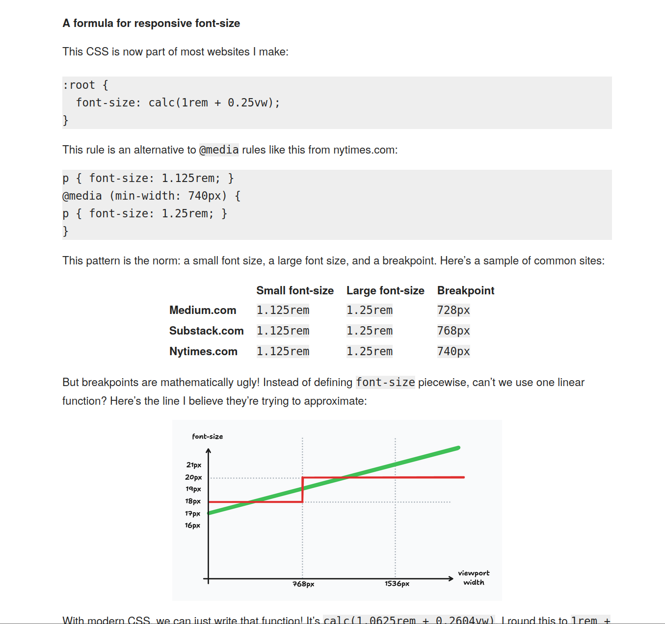
- juancroldan 1 year agoThe point of having font size jumps is to only test screen dimensions right before and after the jump, to check for overflow or excessively large containers. But with a linear scaling this checking requires looking at all resolutions
- chrismorgan 1 year agoMy strong recommendation is to stick to 1 browser em (~16px) on mobile-sized displays, and not to exceed 1.25 browser ems (~20px) on large displays. The formula provided in this article starts you at around ~17px, and exceeds ~20px on viewports wider than 1600px (quite common). That is: it’s too big.
I’d suggest instead something like ~16px at 360px viewport width, and ~20px at 1600px viewport width, and clamping at these values. Slightly different curve, and capped a little more sensibly, in my opinion. (Personally, I tend to stop shy of ~20px, going more for ~18px.)
With these specific values, a verbose expression of the font-size is:
I author fluid clamps in this form, and leave it to build tools like Lightning CSS to simplify the calc expression. For the specific values shown here: 22.5rem = ~360px, 100rem = ~1600px. You can definitely comfortably play fast and loose with the actual numbers./* 1rem @ 22.5rem, 1.25rem @ 100rem */ clamp(1rem, 1rem + ((1.25 - 1) / (100 - 22.5) * (100vw - 22.5rem)), 1.25rem) - kingkool68 1 year agoI like using clamp() so there is a minimum and maximum size. Here's a Sass function to abstract away all the math --> https://gist.github.com/kingkool68/d2da6d3461eb7d47ca5815f9d...
- ericselin 1 year agoWhile I agree with most of the comments that font-size for body text should ideally be 1rem (and certainly clamped), what about headings? When I think about different font sizes I think about headings, where it absolutely makes sense to have a much larger size on wide (/"desktop") screens.
- bee_rider 1 year agoHTML has a header command, maybe that would work?
- bee_rider 1 year ago
- account42 1 year agoThis absolutely the wrong thing to do. Don't scale font size with viewport size. CSS "pixels" are already an abstract concept - if things are too small on your high-DPI screen adjust your pixel ratio accordingly instead of wasting everyone elses screenspace.
- ecaron 1 year agoMy favorite solution in this space remains https://www.modularscale.com/, because (like others mentioned) different device types warrant different scales, BUT ALSO changing line height and padding on a modular scale (also per device type) takes the math out of my responsibilities and puts it on the computer - where it belongs.
- chapterjason 1 year agoI use rfs for that. https://github.com/twbs/rfs
- irrational 1 year agoWhat about the font-size: = 62.5% trick?
html { font-size: 62.5%; }
https://www.aleksandrhovhannisyan.com/blog/62-5-percent-font...
Has it gone by the wayside? Is it no longer a best practice?
- JimDabell 1 year agoThis was always a terrible thing to do.
The idea behind it was that the browser default font size was 16px, so if you set the root font size for your document to 62.5%, then 1em = 10px, and designers who really, really wanted to work with pixels could use ems and pretend they were using pixels without doing complicated maths every time they wanted to set the size of something – they just needed to divide or multiply by ten.
The reason for not just using pixels was partly because it was drummed into everybody’s heads at the time that ems were better than pixels (which, in context, they were, but not when you pretend they are pixels), and partly because Internet Explorer at the time was unable to resize text set in pixels when you increased the text size, which was an accessibility failure.
The problem with this idea is that pixels and ems are fundamentally different types of unit. You can’t make them equivalent using any kind of calculation in CSS. Pixels are objective, whereas ems are based on user preferences. The browser might default to 16px font size, but users can pick something else. So if somebody had poor vision and increased their default font size; or if they had a small laptop screen and decreased their default font size, 1em * 62.5% != 10px, everything the designer set in ems was a different size than they intended, and a lot of their page layouts disintegrated into an unholy mess.
You can’t convert between ems and pixels in CSS. Any calculation like this is fundamentally broken from the start. Nobody should have ever used the 62.5% hack.
- aleksandrh 1 year ago> The browser might default to 16px font size, but users can pick something else. So if somebody had poor vision and increased their default font size; or if they had a small laptop screen and decreased their default font size, 1em * 62.5% != 10px, everything the designer set in ems was a different size than they intended, and a lot of their page layouts disintegrated into an unholy mess.
Howdy, author of the article you're responding to (but not the person who originally discovered/pioneered this trick). This is not true, and my article explains why.
The 62.5% trick is rarely used on its own, but people often cite it this way, leading to confusion. In practice, you set the root font size to 62.5% (of the user agent font size) and then also scale all body text back up to 1.6rem so it's not stuck at 10px. From here on out, all font sizes remain proportional no matter what, even if a user changes their preferred root font size in browser settings. Play around with the math if you doubt it (the article offers examples).
> everything the designer set in ems was a different size than they intended
That's working as intended—your design will scale up or down, according to the user's preferred font size. If you don't like this, your only option is to set font sizes in pixels, which [you shouldn't be doing anyway](https://www.aleksandrhovhannisyan.com/blog/use-rems-for-font...) (disclaimer: also written by me).
- JimDabell 1 year ago> From here on out, all font sizes remain proportional no matter what, even if a user changes their preferred root font size in browser settings.
I think you might have misunderstood my point. My point is not that font size is no longer proportional. It’s actually critical to my point that it is proportional.
The 62.5% trick became popular because designers were used to designing with pixels and didn’t want to design with more fluid units like em. They were forced to by external requirements or often they were just following trends without really understanding them. So they used ems with the 62.5% trick as a substitute for pixels but didn’t change how they designed. So they were still designing with pixels in theory, but using ems as a really bad placeholder.
So if they wanted something to be 100px wide, using the 62.5% trick, they would set it to 10em. This will not get them something that is 100px wide though. This will get them something that is 10em wide, which will happen to be rendered 100px wide only when the browser is using a 16px default font size.
What happens when that fake-100px-but-actually-10em wide element is meant to coexist with something that is actually set in pixels? For instance, a 120px skyscraper ad? The things sized in fake-pixels-but-actually-ems will change proportionally with the user’s font size, but the things sized in real pixels will not. All of a sudden different elements on the page have different ideas about what scale they should be rendered at, and the layout falls apart.
Were you surfing the web with a non-default font size when this particular practice took off? I was, and I could always tell when a site started to use it because their layouts all got screwed up.
If you want to design in pixels, design in pixels. If you want to design in ems, design in ems. But don’t use ems as fake pixels because it cannot work reliably. The two units are fundamentally different and you cannot convert between them. One is rooted in a subjective user preference that can be different on every device, one is an objective measurement.
- JimDabell 1 year ago
- semolino 1 year agoI use:
...and then use ems throughout the rest of the CSS in increments of 0.0625 as "virtual pixels." This, in practice, keeps everything proportional, scaling properly if the user zooms. Only rarely do I run into floating-point quirks, but they're never a big deal.html {font-size: 16px;}- JimDabell 1 year agoThis is very bad for a different reason. It makes it impossible to ensure the size of your text is readable for the user. Your source for this information is the font size of the root element. If you override that using a fixed unit like pixels, you discard this information.
Is 16px too large? Too small? How far away are your text size choices from being readable? You have no way of knowing because you threw that information away and decided 16px was good enough. 16px is not good enough for a lot of people.
The only way to ensure that the size of your text is readable for the user is to use a unit that is derived from their preferences somehow. That means that if you set a font size on the root element, it needs to be a unit like ems. Pixels break this mechanism completely.
Really, just give up trying to make ems work like pixels. You can’t, and everything you do to try to force the issue hurts your design. Design your text to be readable first and foremost. That’s its entire purpose for existing; to be read. If you can’t answer the question “is my body text a size that is readable to the user?”, then it’s bad design.
- JimDabell 1 year ago
- aleksandrh 1 year ago
- JimDabell 1 year ago
- uj8efdjkfdshf 1 year agoHuh, interesting. I've been using a clamped version of 1.5vw + 1vh for landscape and 1vw + 1vh for portrait, and then scaling everything else by rem for consistency. Might give this a try though.
- bryanrasmussen 1 year agodo you have any clamping suggestions for overflowing/wrapping text in buttons etc.?
I ask just because not very many people seem to clamp yet, so looking for experiences.
- bryanrasmussen 1 year ago
- bromuro 1 year agoI don’t understand why font size on mobile should be smaller. Being he device smaller, font sizes should increase, if any.
Others commenters are right here - don’t mess up with the font size, please.
- bkyan 1 year agoIs there a way to do a curved function instead of a linear function?