A New Car UI: How touch screen controls in cars should really work
199 points by matthaeus 11 years ago | 159 comments- jaysonelliot 11 years agoThe designer gave a lot of thought to the problems with current touchscreen UI in cars, and kudos to him for doing so.
However, it's not the solution yet, in my opinion.
First, all the methods of interaction are invisible. There are no cues to tell the user what two fingers vs. four fingers will do, or what the difference is between a close-fingered gesture and a wide gesture. At best, you'd have to standardize the meanings across all cars (something that rarely happens in autos, even today there's no standard for where the wiper controls go, for instance), and even then, people would have to memorize those invisible gestures before they could use their car.
Secondly, accidental inputs would happen with some frequency. People have a wide range of hand sizes, motor control skills, even number of fingers. Suppose I've got two of my fingers in a cast? I can use an existing car's dashboard just fine with that temporary impairment, but not this.
Finally, it's addressing a problem that already has a solution—physical, dedicated input devices. Humans have spatial memory, we learn where things are, and learn to reach for them without looking or even thinking. Your muscle memory tells you how to reach the wiper stalk or the gear shift, which is why it's sometimes disconcerting to get into a car with the gears on the steering column if you normally shift in the center console. We need in-car systems that let the physical feedback, affordances, and reliable location of buttons, knobs, and switches interact with display systems that are designed for the attention a driver requires. You should be able to keep your eyes on the road and still adjust the air conditioning—something the designer in this video recognizes—but that shouldn't require learning invisible gestures that are prone to user error.
- cliveowen 11 years agoI'll also add that there are way too many ways of interactions that must necessarily be learned with a substantial time investment. Time might not seem a big deal when dealing with cars since you keep one at least for a couple years, but the mental effort required to learn all those gestures from scratch is so high that it'd definitely put off most users and result in a frustrating experience for a long stretch of time.
- azinman2 11 years agoYou had the same gut reaction as me but if you look at the beginning before he started using it there was a legend of how many fingers map to each icon (no room for text as well?).
Beyond spatial memory what's good about this is that you don't have to look anywhere while still adjusting (some speech feedback about what mode you've selected would be good). The lack of sight is the most compelling aspect -- but I can guarantee you my parents would likely never remember the mappings and always have to look at the legend. Even then they'll probably be confused.
- jaysonelliot 11 years agoBy "cues," I mean visual affordances that persist, not instructions that are shown before using it. It's a violation of one of the fundamental rules of usability, "Recognition Rather than Recall."
Look at a traditional dashboard. The air conditioning knob is a different shape and size from the stereo's volume knob, and located in a different place (ideally). Those things make it easy for the the driver to distinguish one from the other, and find them while keeping their eyes on the road.
There are other cues that usually exist to help as well, such as a blue-to-red graphic around the temperature control, the volume control being next to other audio features like the radio display, etc.
In an environment where the user has to keep a 3,500 lb steel machine safely controlled while traveling 100 feet per second, the rules of usability become incredibly important.
- hootener 11 years ago"The air conditioning knob is a different shape and size from the stereo's volume knob, and located in a different place (ideally)."
You've nailed it sir. Shape coding[1]. If it's good enough for F-14 fighter pilots, it's good enough for my Toyota Camry.
I echo the sentiment of others. The OPs heart is in the right place here. Mimicking sight free displays on a touch screen is laughably terrible. Take this picture [2] from OPs post. Why are the media buttons ellipsoids? They're just smaller targets to hit compared to squares!
In academia, we've been researching this problem, eyes-free mobile interaction, for a very long time. Particularly in the context of interaction while walking.
There are numerous approaches (e.g., Flower menus [3], utilizing pressure [4], utilizing motion [5], the list goes on). The big takeaway is that it seems like more successful systems result from the multimodal approach.
OP, you've done some good work here, but consider incorporating other sensors. Voice? A camera for in-air gesture recognition? A biometric sensor that gives reasonable defaults automatically based on learned use of the driver? Touch is only one part of the problem if we move away from shape coding, and we will very likely need to utilize multimodal input if we hope for success...
...or, you know, we could just stick to that whole buttons and knobs thing.
-----
[1] http://en.wikipedia.org/wiki/Alphonse_Chapanis
[2] http://matthaeuskrenn.com/new-car-ui/images/statusquo.jpg
[3] http://www.youtube.com/watch?v=QRSASiEBw5k
[4] http://www.mobilevce.com/newsite/sites/default/files/infosto...
[5] http://katrinwolf.info/wp-content/uploads/2013/05/MobileHCI2...
- hootener 11 years ago
- jaysonelliot 11 years ago
- matthaeus 11 years agoYou're making a bunch of good points. All of them show that there's still a lot to try, learn and discover in this space.
And keep in mind: I was thinking of this as being an additional mode to whatever the more "standard" interface would be. You could always have your standard AC controls (on a tactile-feedback-less screen though) but this quick input mode could be invoked when you know what you're doing.
- wahsd 11 years agoI don't agree that he is making good points. He is making points that are of the current mindset. I can see myself and others like me easily transition to that type of interaction until the next generation of customers, aka, kids grows up knowing and feeling comfortable interacting in that or a similarly smart manner.
I do think that the gestures could be broken out into additional interactions, e.g., gestures towards the top do a different thing than the same gestures at the bottom or even have four quadrants that initiate different interactions.
I would think that it would require a type of introduction and practice mode that progressively teaches how to interact and also allows a demo mode like display that can be engaged for those who are not versed in that type of interaction. If not being intuitive was really an impediment there would be no keyboard shortcuts. If you can't take a second to memorize some keyboard shortcuts that will quadruple your effectiveness and efficiency then you cannot be helped.
- jstandard 11 years agoThis is an interesting (and beautiful) implementation, good to see another fighting the good fight against distracted driving. I suspect though that you may not have tested this during actual driving situations. The amount of concentration required to maintain 2 fingers or more on a flat, glassy surface while driving is immense and would result in mistaken inputs in all but the most placid of driving conditions.
One suggestion is to look at the Cognitive, Visual, and Manual Load framework common in automotive UI design. http://www.esurance.com/safety/3-types-of-distracted-driving
This UI concept has a low visual, but very high manual and cognitive load.
- wahsd 11 years ago
- 0xdeadbeefbabe 11 years agoMaybe the designer could attack the standards problem by writing this for embedded android with the idea that android will fill the car ui space soon (assuming the _embedded_ android docs improve).
The UI can provide user feedback with static electricity, and the current could increase with the speed of the car.
As for the final point, a ten key resting within hands reach would work fine. You could memorize the number sequence for different commands, and get audio feedback. Talk about a proven UI, basically the telephone. Baby boomers ought to be comfortable with it.
- SimHacker 11 years agoFrom my experience working at TomTom, which uses touch screen as well as voice commands and feedback, and has purchased automotive oriented companies and integrated their products and employees into their own, I've learned that the automotive industry moves at a glacial pace compared to the computer industry.
There are both good and bad reasons for this. But the important point is that automotive interfaces are designed to be built into cars at the factory, and used for many years without requiring any updates. Even if updates are possible, most people don't get them. So it's a completely different mindset and approach and time scale than people from the Silicon Valley dot-com startup industry have.
Another factor is that the devices built into cars have a very long design and production lead time, and by the time the car comes out, the built in hardware and software is already quite obsolete compared to the smartphone the driver probably owns.
Factoring the problem out of the car to run in a smartphone or tablet itself also has its own frustrating problems, because when you're designing an automotive computer system, you can't predict what kind of technology and standards will be available or popular by the time it ships.
It's a very difficult problem space, and the stakes are extremely high, not just financially, but also because cars are weapons of mass destruction that kill more people and destroy more property than all terrorists combined could possibly dream of.
- jstandard 11 years ago"Factoring the problem out of the car to run in a smartphone or tablet itself also has its own frustrating problems, because when you're designing an automotive computer system, you can't predict what kind of technology and standards will be available or popular by the time it ships."
Would you mind to elaborate on this statement?
To me it seems like moving control over some functions within the car, for example music or calling, might make more sense to do on the phone specifically because of the phone's fast upgrade cycle and tie-ins to one's personal information cloud.
- jstandard 11 years ago
- SimHacker 11 years ago
- yogrish 11 years agoI feel its good concept and addresses current problem of UI in cars. Still, its not a permanent solution as User has to physically touch the screen which is still a distraction while driving. I feel permanent solution would be through a Voice activated controls where you have 360 Degree freedom for yourself. Till then this idea is very much usable for majority of People,Leaving few corner cases as you mentioned("People have a wide range of hand sizes, motor control skills, even number of fingers").
- philwelch 11 years agoI don't really understand why a car's sound system or climate control can't be effectively controlled with physical knobs and buttons. This touchscreen fad will go away, just like the digital speedometer fad of old.
- jotm 11 years agoIt's supposed to reduce costs and material use (if everything uses touch screens, they're cheaper to mass produce) and the dashboard design will be simplified, like how digital electrical systems replaced the miles of wires in analog-wired cars.
But yeah, right now it's stupid - I can't even use my phone well outside when it's a bit cold and my fingers are dry...
- jotm 11 years ago
- jccooper 11 years agoA touch (on a physical object) can make a change in half a second, requires no thinking, and can be done without looking.
Voice control (even if it works reliably, which it does not today) takes several seconds and requires thought in composition and execution.
Touch on a flat screen may be quick, but requires looking. But it's probably not quick, because you'll probably have to change modes, which will require thinking and several seconds of manipulation.
Just put some damn hard buttons on the dash. I know why manufacturers love the screens: they require no tooling, provide lots of real estate for all the doohickeys you want to cram in, and they're hip (Ooh! Like and iPad(TM)!). But they don't belong in cars. Even good ones like Tesla's are bad.
Years ago I said I wouldn't buy a car with screen controls. Now it looks like I just won't be able to buy a new car.
I repeat: Just put some damn hard buttons on the dash.
- philwelch 11 years ago
- SimHacker 11 years agoPie menus frame this kind of interaction as pop-up menus, which provide a "self revealing gestural user interface". The menu pops up and leads you through the possible selections. That feedback trains you to rehearse the gestures. Soon you begin to make the gesture without looking at the menu, then wait for the menu feedback to confirm you're doing the right thing. Finally you gain enough skill and confidence through "muscle memory" to make the gestures quickly without even looking at the screen or requiring any feedback.
It's best if the menus can provide real time in-world feedback, like applying the effect of the interaction immediately as the menu is tracking. That makes it feel more like immersive "direct manipulation" than indirect "menu selection". It's important that pie menus support "reselection", which makes them much more forgiving and differentiates them from traditional blind gesture recognition, so you at any time during tracking you can change the selection to any item you desire.
Pie menus completely saturate the entire possible gesture space with usable and accessible commands: there is no such thing as a syntax error, and you can always correct any gesture to select what you want, no matter how bad it started out, or cancel the menu, by moving around to the desired item or back to the center to cancel.
Handwriting and gesture recognition does not have this property, and it can be quite frustrating because you can't correct or cancel mistakes, and dangerous because mistakes can be misinterpreted as the wrong command. Most gestures are syntax errors. Blind gesture recognition doesn't have a good way to prompt and train you with the possible gestures, which only cover a tiny fraction of the possible gesture space. All the rest of the space of possible gestures is wasted, and interpreted as a syntax error (or worse, misinterpreted as the wrong gesture), instead of enabling the user to correct mistakes and reselect different gestures.
Even "fuzzy matching" of gestures trades off gestural precision with making it even harder to cancel or correct a gesture, without accidentally being misinterpreted as the wrong gesture. That's not the kind of an interface you would want to use in a mission critical application such as a car or airplane.
Another way to reframe the gestural, self revealing and reselectable qualities of pie menus is as navigation through a map, as opposed to climbing up a hierarchical menu tree. Instead of laboriously climbing up a tree of submenus, you simply navigate around a map of "sibmenus" -- sibling menus that you can easily move back and forth between by moving in opposite directions.
This demo of an iPhone app I developed called "iLoci" demonstrates the idea, enabling users to create their own memorable maps of "locations" instead of "menus", which they can edit by dragging around, that are related to each other by two-way reversible links. It exploits the "Method of Loci," an ancient memorization technique from the time before iPhones when people had to use their own brains to remember things, in order to leverage your spatial navigation memory and make it easy to learn your way around. http://vimeo.com/2419009
https://en.wikipedia.org/wiki/Method_of_loci "The Method of loci (plural of Latin locus for place or location), also called the memory palace, is a mnemonic device introduced in ancient Roman and Greek rhetorical treatises (in the anonymous Rhetorica ad Herennium, Cicero's De Oratore, and Quintilian's Institutio Oratoria). In basic terms, it is a method of memory enhancement which uses visualization to organize and recall information. Many memory contest champions claim to use this technique to recall faces, digits, and lists of words. These champions’ successes have little to do with brain structure or intelligence, but more to do with their technique of using regions of their brain that have to do with spatial learning."
I like the idea of moving away from hierarchal menu navigation, towards spatial map navigation. It elegantly addresses the problem of personalized user created menus, by making linking and unlinking locations as easy as dragging and dropping objects around and bumping them together to connect and disconnect them. (Compare that to the complexity of a tree or outline editor, which doesn't make the directions explicit.) And it eliminates the need to a special command to move back up in the menu hierarchy, by guaranteeing that every navigation is obviously reversible by moving in the opposite direction. I believe maps are a lot more natural and easier for people to remember than hierarchies, and the interface naturally exploits "mouse ahead" (or "swipe ahead") and is obviously self revealing.
Here is another video demonstrating a prototype exploring this interface that I developed in Unity3D for Will Wright. It shows both an "iLoci" map editing interface, as well as traditional pop-up pie menus using "pull-out" distance parameters with real time in-world feedback to preview the effect of the selection (plus it also has cellular automata, at Will's request!): http://www.DonHopkins.com/home/StupidFunClub/MediaGraphDemo1...
- cliveowen 11 years ago
- mcherm 11 years agoThis is way better than what they're building today, but honestly, I think a panel of PHYSICAL buttons, knobs and switches is even better.
The iPhone-style interaction -- a flat screen of glass where you manipulate "controls" with touch sensors -- has one major advantage: it allows an INFINITE number of different controls. (Every app is its own set of controls.) But to do this it relies heavily on continual interactive feedback with your vision.
When driving, you can't do that continual feedback. Perhaps someone clever can figure out how to do interactive feedback with audio (you can use that sense somewhat without taking your attention from the road). But otherwise, you can really only manage as many motions as your fingers can "memorize" (muscle memory mostly). If you're doing that, why not stick with switches and knobs, where your tactile sense can help out.
- timdorr 11 years agoWhy not both?
My Model S has these same controls embedded in the steering wheel. Volume, music control, and climate controls are all there.
That's actually where I find I spend most of my time interacting with the car. I usually only use the touchscreen for more complex things like manipulating the map. For complex inputs like choosing a song or entering my destination, I use the voice controls.
I don't think the solution is one interface. It's multiple interfaces that function best in certain contexts, with some overlap. Look at Google Glass for an example of this.
- __--__ 11 years agoSomething in between would be ideal for me. A center console with a touch screen for configuring settings when you're not driving, but physical buttons, switches and knobs on the steering wheel for when you're driving.
- timdorr 11 years ago
- smlacy 11 years agoEverything he shows here is accomplished already by a fairly nice set of buttons on my steering wheel. Each button has a unique shape, so finding them without ever looking down is very easy, and my hands never leave the wheel.
What I find hard about in-car UIs are things like entering and editing navigation directions or selecting music to listen to given a 32GB USB stick full of songs.
There's always some horribly designed onscreen keyboard or "iDrive" type knob controller, both of which are quite horrible experiences. To make matters worse, the UI is laggy and unresponsive, and in an effort to make things "easier" onscreen controls frequently dim & disable when not actionable or when the car is moving vs. stationary.
- GuiA 11 years agoAgh! Do we never learn?!
http://worrydream.com/ABriefRantOnTheFutureOfInteractionDesi...
- rikkus 11 years agoHe's very right. But his home page doesn't scroll properly with the wheel on my mouse.
- kbenson 11 years agoI really need to go through and read all of his site some time. I've been a fan for years, but still only read a fraction of what he has on there (basically, what people link to).
- hisham_hm 11 years agoDoes he have any books published? I'd buy it.
- hisham_hm 11 years ago
- joeblau 11 years agoBret deploys utter brilliance every time.
- matthaeus 11 years agoI love that rant.
- rikkus 11 years ago
- joosters 11 years agoHis examples are unfortunately pretty terrible. Volume control and air-con are all settings that you frequently adjust. These are not the controls that should be hidden in a touchscreen.
It's the dynamic, changing display of touchscreens, where you can navigate through a menu (or other structure/organisation) of settings, are where the real benefits lie. If, like in the video, you don't make use of the screen, you're left with a tablet-sized void on your dashboard. Most people agree that the existing buttons and dials are far better, easier and intuitive to use, so your volume & fan speeds are going to be best served by physical controls.
The problem is with the less-used controls. Cars have lots of settings and if you add a button or dial for each of them, you'll end up with something looking like an audio mixing desk. This is where touchscreens and displays can improve the UI. A well thought-out system should let the driver find any setting they need and let them adjust it. Leave the common controls as-is, and work on how best to present the others on the screen.
- matthaeus 11 years agoI like your audio equalizer analogy.
If you look closely in the beginning of the video, you'll see that I'm proposing for this to be a special mode that would only be invoked from time to time. So as you are suggesting: It's all about showing the right controls at the right time.
- matthaeus 11 years ago
- 51Cards 11 years agoInteresting concept but I am concerned about using multi-touch to select devices. First off it's hard to remember, and secondly, if I am missing a finger, I can't set the air-flow rate in my car? Also the differentiation between close and spread fingers is going to be tricky for a lot of people to remember.
Edit: Another thought... the UI for many funtions needs to provide visual feed back... say for what system I am selecting or what station I am tuning. The text is quite small which would cause even more of a distraction to try to read. Yes I can begin the selection process without a visual cue, but I still need to look to see what I'm selecting. Not sure I see a large improvement in driver distraction there.
Slick for users like us? Definitely. Intuitive for the average Joe out there? I don't think it would fly. Too much to remember and too much dexterity required. My Mom could never use this. At best I see this as an alternate UI the driver could select over something more conventional when they feel comfortable with it.
Kudos for thinking outside the box though, there are definite UI gems here that could be leveraged.
- windsurfer 11 years agoI personally wouldn't scrap an entire design when < 1% of the population can't use it.
Intuition isn't important. The designer mentioned that this is a trade off, and is intended for regular users who have muscle memory of their controls. You can always add a tutorial or "help" mode by pressing a button in the bottom right or whatever, anyways.
- matthaeus 11 years agoThe beauty about touch screens as input mechanisms is that they can obviously show an infinite number of interfaces. I absolutely agree that there's a right time for the right interface. My proposal is just one possible way to use a touch screen for input.
- scott_karana 11 years agoIt's not just people missing fingers. Anyone wearing gloves, or with dirty hands, will have issues operating a multitouch screen, in a different way than people with phones might.
- matthaeus 11 years ago
- windsurfer 11 years ago
- mbesto 11 years agoTouchscreens are not only dangerous to drivers, but fairly unusable unless you can make judgements based on touch alone. I've used this[0] system before and it satisfies both of those requirements. Can it be optimized further? Possibly. But I don't beleive touch screen is the future (until we get driverless).
[0]- http://www.bmw.com/com/en/newvehicles/x/x5/2013/showroom/dri...
- XorNot 11 years agoOthers have said it in softer terms, but IMO this is a horrifically bad design.
The fact it's not implemented in a car is why it seems like good design - because sitting focusing on your iPad with no other way more important task to deal with means you can 'figure it out'.
How do I tell a casual driver of my car how to adjust the A/C? Or the radio and GPS? How do I tell - at a glance - which control I need to hit? I can't even hit a control - I have to somehow apply steady constant pressure to the screen to execute a gesture - so that's completely incompatible with anyone who likes their seat a little further back.
The use of any amount of press and hold gestures is completely unacceptable, yet that's the first thing we see on the screen.
- TheLoneWolfling 11 years agoUntil touch screen controls have haptic feedback, I'll much prefer physical controls.
Same reason why my phone has a physical keyboard.
- mankyd 11 years ago> I'll much prefer physical controls.
I generally agree. I just bought a car and one of the reasons that I skipped the nav system is that I didn't want a touch screen for things that work better as knobs.
That being said there is a balance to strike in today's smart-device world. Having a touch screen can save space and reduce control clutter when trying to cram bluetooth, gps, hd radio, playlist, and other controls onto the dash. They allow the car to only show me what I need when I need it.
Looking at most touch screen dashes, such as those in the article, show that they fail at this, of course.
- lsaferite 11 years agoWhat interfaces did you lose with touchscreen nav that you didn't have on the steering wheel already?
- lsaferite 11 years ago
- SimHacker 11 years agoIn a conference room at Sun in the 1980's, I saw a touch screen control panel on the speaker's podium for raising and lowering the lights, projector screen, controlling the projector, etc. It has a small solenoid with a rubber mallet at the tip which would go "thunk" against the back of the glass to provide haptic feedback for the virtual buttons. Pretty low tech, cheap, simple but effective.
- mankyd 11 years ago
- donatj 11 years agoThis is the problem with "modern" society / "invention". Touchscreen is not an improvement. It is in fact a downgrade. It adds nothing to the driving experience, and makes the device harder to use.
To quote Antoine de Saint Exupéry, "It seems that perfection is reached not when there is nothing left to add, but when there is nothing left to take away"
Modern "convenience" is more like modern pain in the ass.
My car is a 1991 and has manual locks, manual windows, manual everything.
Beyond the radio the only buttons in the entire vehicle are the headlights. There is a button for the lights, and one for the brights. Pressing the one for the brights is rigged in a way that physically enables the bright button if it is not already depressed. High tech.
The heat controls consist of two vacuum powered left to right sliders.
I find myself want for nothing. Nothing. So simple. Nothing to break, nothing to worry about. It gets me from home to work, and back, reliably. It does what a car should.
- banachtarski 11 years agoThe designer evidently hasn't looked into any of the multitouch research. This interface would actually be far harder to use, learn, and get accustomed to than existing interfaces. It's unintuitive. There's no reason why 2 fingers should correspond to volume. With loose coupling like that, and no standards committee, hopping from one car to another will be extremely annoying.
Interfaces need to have strong couplings between action and zero overloading. Two finger ubiquitously means "scroll now" on trackpad. But even on an iphone, multitouch is seldom used for this reason. A trackpad has no images to display, so it is forced to overload gestures with multitouch. Phone don't have this limitation, and thus, intelligently avoid the use of multitouch.
As another anecdote, mobile games that rely on multitouch tend to not do so well.
- yalldraw 11 years agoCan you link me to the research you're drawing from?
- banachtarski 11 years agoI know this secondhand and first hand from the companies mentioned (and another I won't mention) but the actual studies are "corporate" IP unfortunately. You are encouraged to try different schemes yourself if you have a phone or tablet dev kit though.
- banachtarski 11 years ago
- yalldraw 11 years ago
- msandford 11 years agoThis is hands down far, far better than what's out there already. A lot of thought went into this and it shows.
Could there be a few options to enter other modes, though? What I mean is that right now there are only 8 adjustments possible. That's better than the 4 I thought it was limited to, but still nowhere near enough for modern cars.
I would estimate that on a modern car you need to be able to adjust something like 100 parameters. Only a few of them frequently, but definitely more than 8 in total.
One of the thoughts I had was that using a (say 90 degree?) twist motion along with a number of fingers could bring up sub-menus. That way if you want to adjust other radio parameters like fade, balance, equalizer, etc you would put two fingers on (for volume) and twist.
Maybe you'd arrange the different controls in a loop so that every twist indexes to the next and there's a ~10 second timeout before you head back to the default. So if you want to adjust all the "volume" parameters you put two fingers and twist right once for balance and adjust, twist right again to get fade, twist right again to get highs, etc. Make a mistake? Twist left to go back and re-adjust.
If you want to get out of one of the sub-menus you're in prior to the ~10 second time-out for default, another gesture? Maybe a double tap? I don't know on that one, really.
- masklinn 11 years ago> I would estimate that on a modern car you need to be able to adjust something like 100 parameters.
Not the author, but the way I see it this is specifically an interface for adjusting things eyes-free when driving. In an actual implementation, there would be some sort of physical switch between the in-drive control (demoed here) and a high-density "at rest" operation for passengers or more specific tasks (e.g. configuring the GPS).
> One of the thoughts I had was that using a (say 90 degree?) twist motion along with a number of fingers could bring up sub-menus.
The problem with this is there'd likely be a rotational component to movement, and a movement component to rotations, discriminating becomes harder and the chances of false positive (and thus frustration) increase. Only using a single axis is actually a smart move as far as I'm concerned.
- SimHacker 11 years agoI've found that pie menus with four different directions are quite reliable (see the description I posted here of the ConnectedTV palm app, which supported buttons with four different stroke directions plus tap). Eight different directions work well with a mouse or big touch screen, in situations where you can afford to give the screen some visual attention and the consequences of making a mistake aren't deadly, but I believe four directions are reliable enough for automotive applications, as long as you require enough motion to get enough "leverage" and give decent feedback.
- msandford 11 years ago> The problem with this is there'd likely be a rotational component to movement, and a movement component to rotations, discriminating becomes harder and the chances of false positive (and thus frustration) increase.
I agree that you might end up rotating your fingers SOME while moving them up or down. But I'm not sure that I agree that you would move them 90 degrees completely unaware. In order to move your thumb and index finger from vertical aligned to horizontally aligned you're going to require some (maybe a lot) of wrist motion. It's hard to make that wrist motion happen accidentally.
You might end up setting it to accept a range between 70 and 120 degrees to qualify for a "go to the next setting" motion and you can provide some kind of feedback (vibratory or audible or both) that you have indeed twisted far enough to trigger the change.
- SimHacker 11 years agoWhen designing pie menus, there are both physical (articulatory) and mental (cognitive) factors that you should consider when choosing the number of items and their directions.
Gordon Kurtenbach and Bill Buxton did an experiment that varied the number of menu items and measured the selection time and error rate. They expected the selection time to be monotonically increasing as they added more items. To their surprise, that was almost true, except for the transition from seven to eight items. It was quicker to select from an eight item menu, then from a seven item menu!
That, I believe, was because of the effect of the cognitive bottleneck of associating the items with which direction to move, not the physical difficulty of moving in those directions. While the slices of the seven item menus were wider and had more area than the slices of the eight item menus, and Fitts' Law would predict that seven item menus were faster than eight item menus, Fitts' Law does not take into account the time it takes for users to map their intended command to the direction of that command, and how the mental framework in which users remember and relate the directions to each other affects selection time.
Eight item menus have all of their items in well known directions, each of which is associated with a very familiar concept, which come in nice pairs, and the pairs come in convenient orthogonal groups, like up/down, left/right, vertical/horizontal/diagonal, like compass directions.
Twelve item menus like a clock face also work well, especially for circular sets of items like hours, months, zodiac signs, etc. But the effect going from 11 to 12 is not as dramatic as from 7 to 8. But still the 12 item menu has a nice familiar aesthetically pleasing cognitive framework (including opposite and orthogonal pairs, first tier vertical/horizontal axes and second tier in-betweens) that you can often exploit, depending on the content.
Three item menus are still slightly faster than four item menus, because the effect of the proportional difference in target area overwhelms the difference in the number of items, and two of three triangular directions are well known concepts that are pretty easy to remember, compared to six of seven directions.
An eight item menu optimally exploits that effect, while a seven item is unfortunately sub-optimal with mostly difficult to remember directions. There's no word or concept in the English language for six out of seven of those directions -- they're all just kind of slanted differently, similar to but not quite like the well known compass directions, and there are no nice symmetries, opposite or orthogonal groupings to exploit, by arranging complementary items in opposite directions, independent pairs along orthogonal axes, etc.
So if you're designing a pie menu with seven items (or even eleven), it's better to just throw another item in to bring it up to eight (or twelve)! I gave an example in the DDJ article of a "seven days a week" menu with an additional "today" item thrown in at the bottom to bring it up to eight, with the weekend and today in the lower part of the menu, and Wednesday at the top. See, I don't even have to link to a picture or enumerate every item for you to easily visualize and remember it!
- SimHacker 11 years ago
- Schwolop 11 years agoI would build this switch with two IR sensors on each side of the console. If the arm and hand touching the screen is approaching from the passenger side, many things are possible. If the car is in motion and the arm is approaching from the driver's side, many things are locked out.
- matthaeus 11 years ago> Not the author, but the way I see it this is specifically an interface for adjusting things eyes-free when driving. In an actual implementation, there would be some sort of physical switch between the in-drive control (demoed here) and a high-density "at rest" operation for passengers or more specific tasks (e.g. configuring the GPS).
Yes!
- SimHacker 11 years ago
- banachtarski 11 years agoIt's really not. It's a huge step back from even the interfaces he presented.
You exhibit the symptoms of somebody just introduced to multitouch and gesture recognition and trying to "explore the possibilities." The reality of gesture control is that they make for horrible user experiences. You are encouraged to try it on your own if you aren't convinced. Adobe, Apple, and a number of other companies did a lot of user study into this.
Double tap, twists, etc. All those gestures suck and fail for different reasons sadly.
- msandford 11 years agoActual buttons are better than fake buttons on a touch screen. What he dreamed up is in my opinion better than fake buttons on a touch screen. Real buttons might be better than his interface.
I got interested in multi-touch something like 6 years ago when I saw this: http://vimeo.com/6712657 So I don't think that I'm someone "just introduced to multitouch" at all. But thanks for trying to subtly call me a naive idiot!
So far the best people are able to do is two finger scrolling and pinch zoom. It's kinda sad.
- banachtarski 11 years ago> What he dreamed up is in my opinion better than fake buttons on a touch screen.
No you are "new to multitouch" in the sense that you haven't tried to implement multitouch yourself, conducted a user study on multitouch learning curves and intuitiveness, or used a real life application exhibiting the multitouch you claim to understand for a prolonged length of time.
Seeing one video qualifies you perfectly for being "just introduced to multitouch."
- banachtarski 11 years ago
- msandford 11 years ago
- gutnor 11 years agoAt some point you would probably be better off having physical button. A huge touch screen on which you need to draw weird gestures you had to memorize does not strike me as very user friendly.
That said that is neat implementation and it very elegant but I would like to have that in the living room rather than the car.
A possible evolution I guess would be to have different screen you would flick through that would group 2 or 3 command together with a big visual cue on the background.
- qq66 11 years agoIt's hands down better than other touchscreen-based controls. It's still quite a ways behind the old technology -- i.e., physical buttons.
I drive a 1998 car and can operate every single control without looking at the console, except audio tone controls and choosing a specific FM station not in my presets. Granted, navigation is missing since it's an older car -- better voice controls on the phone could make up the gap.
- matthaeus 11 years agoInteresting ideas. Maybe this is just me, but my wrists suck at twisting.
- masklinn 11 years ago
- TruthSHIFT 11 years agoCar manufacturers need to give up on the idea that one screen should control everything in the car. A touch screen just isn't suited for every task. Knobs are the best volume control and this is unlikely to change. They are also a great way to control air flow volume and temperature. While a touch screen could be great for selecting music to play, the other functions of the dashboard shouldn't be shoehorned into a touchscreen.
I'm not sure that the New Car UI is better than what car manufacturers have already done. None of the functions of this interface can be easily discovered. You would need to watch a training video to learn how to use one of these. It would be too easy to forget which gestures correlate to each function.
- bbx 11 years agoThere's so much to say about this video, but I'll summarize it by quoting one of my favourite articles: "Solving the wrong problem". [1]
(By the way, itt's funny how nowadays, hardware UI is immediately associated with "touch controls".)
- mbell 11 years agoPerhaps I'm just not envisioning it correctly but this seems to replace looking at the screen to touch a button with looking at the screen to figure out how far apart my fingers are, or how many fingers have touched the screen after hitting a bump. I'm not yet convinced it's a great improvement, though an interesting idea. I'd like to see a demo in a more realistic environment, i.e. in a car on a non-perfect road rather than on a table.
- ianferrel 11 years agoMost people can tell how far apart their fingers are via proprioception. It may take a little while to know where the boundaries are, but it's easy to determine if your fingers are close or far.
Feeling how many fingers are touching the screen is also easy with the normal sense of touch. Add in a little hysteresis to handle bumps (you could even integrate info from the accelerometer) and I bet that even bumpy conditions will be significantly improved with this system.
- mbell 11 years agoAs someone who has instructed parents and other non-techies on how the number of fingers and how to move those fingers on a multi-touch display, I don't consider it remotely trivial for 'most people'.
- mbell 11 years ago
- ianferrel 11 years ago
- mankyd 11 years agoNeat, but I'd imagine that this represents a steep learning curve for many. Say that I borrow a friend's car that has this. How do I figure out how to change the temperature? Touching five fingers close together is easy but not intuitive.
- Nate630 11 years agoI agree. There are many good interface ideas here, but cars interfaces need to reach people of all sorts. ie. people with handicaps, disabilities, etc.
Great ideas though. It's great to see someone working on this! Nice job.
- masklinn 11 years agoIt could probably be clearer/more detailed (e.g. have actual instructions), but this: http://matthaeuskrenn.com/new-car-ui/images/07.jpg is basically a howto + configuration pane
I don't know how to invoke it on the demo/prototype though.
- matthaeus 11 years agoTry tapping in the very bottom right corner with one finger. There's an invisible button that shows the fake Driving Directions UI. Then tap on that with 5 fingers at once to make the hints appear. They are just static graphics too though.
- matthaeus 11 years ago
- Nate630 11 years ago
- stevewilhelm 11 years agoI personally feel one should be able to locate and modify any automobile control without having to look away from the road.
I find it interesting that the Boeing 787 uses five 15 inch displays, but for information display only. Input is still done with buttons and knobs.
[1] http://www.boeing.com/commercial/aeromagazine/articles/2012_...
- viraptor 11 years agoThis may be quite hard to learn for a while. Especially the less often used options. I'd be interested to give it a go though.
For now the best car interface I've used was voice recognition. It usually works great, because it's not a general purpose text dictation. It only needs to recognise less than 100 words and it's not that hard to do. For example I'm not a native English speaker, and I can't get google voice input to capture most of the sentences correctly - it's simply not usable for me at the moment. But I'm quite happy to use voice commands in a Prius - I don't think I've ever used more than 4 or 5 of them, always perfectly recognised.
- debt 11 years agoVoice seems to be the best and safest user interaction for vehicles. If the voice software knew the car was in motion or at a difficult intersection perhaps it could change it's tone and sense of urgency. It does make me think if there will be VI(voice interaction) designers in the future.
- aestra 11 years agoI find voice controls extremely distracting, mentally. It takes your focus off the road just as much if not more, I believe. Plus, I always have to repeat myself a bunch because I believe they are programed to recognize a man's voice.
- aestra 11 years ago
- matthaeus 11 years agoDo you have an iPad? Save a bookmark to your homescreen for this URL: http://matthaeuskrenn.com/new-car-ui/prototype/
- debt 11 years ago
- surfmike 11 years agoCreative ideas. However, discoverability is poor. Can you imagine getting a rental car or borrowing a friend's car and getting this to work?
Also, this uses a whole iPad screen to control 8 settings-- eight knobs would take less space and maintain the benefits of a physical interface.
Personally I think commonly-used controls like volume, temperature, fan speed, and some music controls should have physical dials. You can then find them by feel, they're reliable and modeless, and they're much easier to understand. Then, leave the touch screen for navigation and more advanced features.
- beloch 11 years agoIf you're driving, you don't want to be looking at a touch-screen and you certainly don't want to be simultaneously trying to recall how many fingers turns the radio off! Physical buttons utilize spatial memory and offer haptic feedback, allowing users to keep their eyes on the road most of the time. Removing physical knobs, switches, etc. and replicating their function with a center-console touch-screens is a horrible thing to do to drivers, no matter how good the interface is. For this reason, the center-console touch-screen is unlikely to be the center of car-interfaces for long.
Okay, so what's better than a center-console touch-screen for user feedback? A transparent display either in the windshield or just behind it. Yes, a fighter-jet style HUD. The user could be twiddling buttons on the dash or smearing his/her greasy-finger across the inner surface of his windshield (only for infrequently used functions). The important thing is that user feedback comes from the same place that a driver's eyes ought to be directed when driving!
P.S. As a resident of a frigid country, let me just add that the less I can control with a pair of mitts on the less likely I am to buy your car.
- _pmf_ 11 years ago> A transparent display either in the windshield or just behind it.
You'd be hard pressed to find anything less ergonomic than fiddling with the windshield behind the steering wheel.
- _pmf_ 11 years ago
- pkorac 11 years agoHere's a brilliant completely new idea: what if you had big simple physical buttons and knobs?
Oh wait, that's how it actually worked before we've broken it…
- flogic 11 years agoExactly. Read something awhile ago about NASA testing potential Mars rovers. They wrote off touch screens. They're cool and all but not ideal for situations in which you're being jostled about and you may be wearing gloves.
- flogic 11 years ago
- npizzolato 11 years agoI like the design of the UI and think that there are a lot of good ideas here that could be used in other domains. But you started the video saying current designs are filled with intangible buttons and are therefore hard to control and are distracting, and I think there are some fundamental issues with this design that do not solve these problems.
If I'm already familiar with either my current car's touch screen UI or your design, I can do anything pretty quickly. So the real question is what happens when I don't know or remember exactly how to operate it. Say I'm driving on the highway at 60-70 mph, and I want to change my radio input. How many fingers was that? I can either try all the combinations, which would be incredibly distracting. Or I can figure out how to bring up that legend (better remember how though since there's no indication) and stare at the tiny buttons. Now, since only one option is displayed at a time, I need to figure out the spacial relationship between FM and AM. Is AM a swipe up or down from FM? Is there something in between? I need to constantly be checking the dashboard as new selections are made. This sounds incredibly distracting.
And I'm expected to do all of this while driving at 60 mph. Granted, much of the current touch screen UIs in cars suffer the same problems. But you haven't solved those problems in any meaningful way.
> All in all, this interface gives you easy control over 8 different settings. And it does that without you having to take your eyes off the road because you're being distracted trying to hit that one small button on the screen.
I have a hard time believing the vast majority of people would be able to operate this interface without taking their eyes off the road for a significant amount of time.
- matthaeus 11 years agoFair points. I'm most excited about this actually:
>...good ideas here that could be used in other domains.
I'd love to see more touch UIs that serve as secondary input mechanism for something else. If I had a big color picker for Photoshop in my iPad I would already be ecstatic!
- matthaeus 11 years ago
- monkeynotes 11 years agoI have a hard enough time getting multi-finger gestures to actually work on my iPad and that's while it is right in front of me with my full attention. I can't imagine this all happening while trying to drive the car too.
I think we have too much shit distracting us in the car as it is. I am more than happy with physical dials and sliders for A/C, dials and buttons for the audio, and hopefully someone will come up with a descent Siri-like voice command input for messages/voice and GPS.
Asking me to interact with a blank screen and having to look at it to make sure it's doing what I want is asking for trouble. Just the other day a cop was walking the line-up at the traffic lights and booking anyone who was fiddling with their phone.
- matthaeus 11 years agoThe thing is though: What if in the future, every car primarily has touch interfaces? Touch screens certainly took over a lot of other product categories by storm. I'd rather be on the side of exploring out-there concepts now, and hopefully have some cool solutions in the future.
- monkeynotes 11 years agoIn the future cars will drive you. You'll pay higher insurance premiums to have the right to drive the car yourself.
Touch screens that you have to actively look at to interact with will still be distracting and therefore I cannot see how they will become a primary interface of future driving. Voice command with feedback will take over here when it is mature enough.
- monkeynotes 11 years ago
- ajcarpy2005 11 years agoIs it really illegal to use your phone while stopped at a stoplight?
- monkeynotes 11 years agoHere in BC you can't use a hand-held cellular device in stopped traffic:
http://www.icbc.com/road-safety/safer-drivers/distractions
"The law applies even when you’re stopped at a light or in bumper-to-bumper traffic"
- SimHacker 11 years agoSince when did something not really being illegal prevent a cop from booking or at least harassing people doing something he didn't like? ;) Not that I totally disagree with him in this case, though. ;(
- monkeynotes 11 years ago
- matthaeus 11 years ago
- rayiner 11 years agoVoice control or GTFO. It's already dangerous enough changing the radio channel with the physical button I know by feel. Touchscreen with no tactile feedback sounds like disaster.
- jff 11 years agoI am fond of the controls in my car. Pretty much everything is done through a simple knob with a label above it.
On the far left, a knob for lights. Pull out one click to turn on parking lights, all the way out for headlights. Twist left and right to adjust dashboard brightness.
Next to that, fan control. One click out for slow, all the way for fast.
Just to the left of the steering wheel is the heater control. Pull it out for low->high heat on a sliding scale, rotate it to control the defrost.
Immediately to the right of the steering wheel is the cigarette lighter.
To the right of that is the wiper control. One click for slow, all the way out for fast.
Center of the dash is the radio. One knob to turn it on and control volume, one to tune.
You might have guessed that this isn't a modern car. It's a 1962 Studebaker. The controls are simple, clearly labeled, and do everything you need. You don't even have to look down to find the right control, you can just count the knobs from one side to find the right one. You can easily tell the state of the heater or lights because you can see and feel the state of the control. You don't really even need fine motor control except for tuning the radio, and that's pretty forgiving too. Were I designing a car interface, I'd consider the lessons presented there.
- futileboy 11 years agoI really like this. My only issue is that the prototype ignores single finger, which to me feels like it should be the most important control. The other issue with number of fingers based gestures is, well, people who are missing fingers. I also think using both the X & Y position could be really useful. Why not tune the radio by dragging up and down and adjust the volume by move right and left, or other combined gestures?
- msandford 11 years agoI kinda feel like the default screen for this thing would be a map, so a single finger would just scroll the map around. And with one finger you can't find a diameter so there's no second option with wider spacing for a single finger.
I really like the idea of an always-on GPS that can intercept commands for other stuff (radio, HVAC, etc) and forward them to the appropriate app/microcontroller/hardware.
- maxerickson 11 years agoOne possible explanation is that these are intended as additional controls and the single finger interaction is still reserved for a more button based approach.
- matthaeus 11 years agoThat's how I imagined it too. Single finger would be reserved for getting back to a more conservative input mode.
- matthaeus 11 years ago
- msandford 11 years ago
- micheljansen 11 years agoI came up with a similar solution while doing research on "eyes free touch controls" for a certain multinational engineering and electronics company a few years ago.
We found that these types of control perform well, because they effectively have an infinite surface area, but they are not very intuitive, especially when the number of fingers is used to distinguish between different controls. We ended up settling for slightly less "mystery meat" controls similar to Apple's UIDatePicker, which offer a good compromise between being immediately clear and offering a large initial touch surface (which is all that matters, because as soon as you are scrolling the control, your finger is tracked even if it leaves the component).
Touch screen interfaces still have a long way to go before I consider them safe for use in a car though. I did some testing with an eye tracker as well and found that people still glanced at their hands a lot (even after adding artificial tactile feedback). I wasn't able to account for prolonged exposure / experience in my experiments, so maybe it gets better after training.
- x0054 11 years agoNow mount the iPad in your car and try using it while going at 50 mpg over even slightly bumpy road. Physical controls give you tactile feedback, but more important, they give you something solid to hang on to while using the controls. Touch screen is good for GPS or settings screens. But often used knobs like heat settings, lights, and such, should be physical.
- sbashyal 11 years agoI like this attempt to rethink the UI for vehicles and I think you are on to something. The absence of any cues I guess is still a problem and the finger-distance based approach could be a problem for some.
How about selecting what you want to control (Temp, Channel, Air etc) on the first pass followed by adjustment of the selected control on the second?
- masklinn 11 years ago> How about selecting what you want to control (Temp, Channel, Air etc) on the first pass
But how would you do this selection, and know unambiguously that you've selected the right control without looking at the display?
- masklinn 11 years ago
- NDizzle 11 years agoTangent - because I believe I'm a minority here on HN - a hobbyist mechanic.
Right now one of the worst things to see are these all in one NAV/radio/media/HVAC devices. They are basically impossible to troubleshoot without specialized equipment. Only dealerships have these - the private garages don't see enough volume of particular makes and models of cars to warrant a purchase.
As this becomes more and more common I may even double-down on learning how to fix these things, because it will very quickly become an essential skill in the not too distant future.
Think briefly about the instrument cluster that was in the car you drove up until about 2010. Then do a quick skim of various manufacturer sites and examine the kind of clusters that are going into even new Dodges and Fords - not to mention luxury cars.
Can you imagine having to go to a junkyard to pull out an instrument cluster for a 2011 Ford Festiva in the year 2020? What a nightmare.
- cpwright 11 years agoThe most common buttons are already on the steering wheel, not the touch screen, so I really see limited functions that this can manage. The big problem I see is that there is a lot of nuance to using this, and it will take a while to get used to.
Once you're used to it I think it could work, but learning how to use the controls is a big deal. For the most part I can control the stereo or temperature in any car that I may happen drive, and so can most people without really much of a learning curve. Setting the clock or mucking with a GPS might be a bit tougher, but the basics are all there. The most likely time that you'll be learning how to do this kind of stuff are while driving, so it should be as obvious as possible, with as little need to focus on it while figuring out the controls.
- Tloewald 11 years agoCool. Useless. As Don Norman might say about it years from now "it probably won an award".
I have a simpler and -- I think -- demonstrably better solution:
1) A minimalist HUD overlaid on the windscreen. (As simple as possible -- an icon, text label, and a simple readout, e.g. "Nav Icon: Driver Side Climate 72°F" or "Sepulchre Ave <-- 500ft" or "FM Radio: WAMU 88.5MHz [xxx ]")
Benefit: Driver's eyes stay on the road. What you're doing is utterly unambiguous.
2) Steering wheel buttons that select the mode (channel select) and value (volume buttons). For bonus points, allow two value selectors (so you can adjust station and volume in one mode
Benefit: Driver's hands stay on the road. Steering wheel has touch-affordances to help you find things on it. The buttons already exist on many (most?) cars.
- frankus 11 years agoThis seems like a really clever implementation of an system that's probably a passing fad.
Touch screens are great for portable computers both because they need to be small and because they need to enable a potentially limitless number of operations.
In a car the number of things that need adjustment while driving is relatively small and doesn't really change. We've had climate and audio controls since the 1950s. We've since added speakerphones and navigation, but the former only requires a couple of buttons, and the latter shouldn't really require any adjustment while driving.
There's also no shortage of space to put the controls.
My guess is that touch screens will start to dominate in cost-sensitive segments of the industry, while physical controls will migrate to luxury status in a few years.
- aaront 11 years agoI'm actually a big fan of the Hyundai Veloster's touch screen. It provides all the functionality you'd expect, without the convoluted menu systems of other cars.
http://gaspuol.files.wordpress.com/2012/11/2013-hyundai-velo...
http://www.extremetech.com/wp-content/uploads/2011/09/MY12_F...
Granted, this UI looks great, although has a few interaction oversights: what if I lost a couple fingers in an industrial accident and only have 3?
- achamayou 11 years agoThe biggest oversight seems to be the utter lack of discoverability. Can you imagine trying to figure out of this works on a rental car ? or explaining to your grand-father how this works ?
- achamayou 11 years ago
- emehrkay 11 years agoBMW's iDrive was/is considered a mess because of the single knob-do-everything approach, but it had potential for what could had been. This seems like it took what bmw had, implemented it as a virtual knob and removed the main problem (idrive's submenu system). I like this, great way to think about the problem and present a potential, easy to understand solution. This approach also allows the touchscreen to be put in a more natural position like closer to the arm rest. I'd just make it a taste more visual. I bet the haptic feedback that some android keyboards offer when keys are pressed would be a great addition.
- adav 11 years agoThe latest iteration is pretty much spot on. Everybody unfairly discredited the first version - the technology hadn't matured. Much like the iPhone 2G (dismissed by the majority of non-techies)! However, not everyone can afford a brand new BMW, whereas pretty much everyone I know has an iPhone/Android, so their opinion was never re-evaluated.
The latest iteration is virtually perfected. Rocker buttons on top, and with a known number of clicks I can control 80% of all the main functions without taking my eyes off of the road at all. For the other 20%, it takes a quick glance to see the state of the screen and then I know "okay, now just two clicks down and I'm there".
The upcoming version (currently on the only the latest model to be released) has a small circular touchpad on-top of the wheel so you can draw letters without having to twist the knob. Useful for entering Postcodes into Nav, for instance.
I recall that both Audi and Mercedes have since copied the iDrive paradigm.
- erobbins 11 years agoidrive is way better now than it was initially... they added some buttons. I use it every day and it's very easy. if bmw tried to replace it with some touch screen gizmo I would push the car off a cliff.
- adav 11 years ago
- Schwolop 11 years agoLovely, but one fairly critical problem - for the 88% of people who are right handed, driving in the 35% of the driving world that drives on the left, they'll need to operate the centre console with their non-dominant hand.
- acomms 11 years agoSome things just need buttons.
- dredmorbius 11 years agoCount me in the "give me my knobs" crowd: for frequently-accessed features, I absolutely want physical controls. Including temperature and fan, audio, AC, etc. I'm not even much of a fan of the shift toward "programmable" temperature controls: when I'm changing the temperature, it's because I'm too hot or too cold -- what I want is to move the indicator toward where I want to be and not fuss with it. A given cabin temperature: 68F, say, might be comfortable on an overcast day, too warm in direct sunlight, or cold when it's below freezing outside and drafts are intruding.
That said, a few nice features here:
• Moving the control to the user. Ages ago I noticed a trends in desktop UI. When a window would open a dialog, typically it appears more-or-less at some random location on screen. Microsoft came up with a solution for this: they'd "warp" the mouse pointer to the dialog location. Which meant that wherever I thought my pointer was, it wasn't. A crufty old Unix graphics package, xv, had a much more elegant solution: It would open the dialog, with the default option button positioned under the pointer. It's subtle and it took me a while to realize it, but it floored me when I finally caught on. Sadly, I don't know of any other application (much less desktop or GUI) which practices this principle. Matt's example here does, it's the first I've seen of this in nearly two decades.
• The multi-finger touch thing ... I might actually get used to that. Maybe not for primary controls as indicated, but for other advanced features (say, a mapping / navigation system). No, it's not going to work for everyone, but a fallback mode (or modes) could work: hot corners, or similar features.
• Keeping the interface pared down to just what's being acted on is useful. I've been going through the process of stripping down web interfaces, mostly for my own benefit, and one thing I've come to realize is how an ugly, messy, disorganized UI often is hugely improved by junking most of it. For most websites I visit, what I'm interested in is the primary content, so getting rid of the ancillary bits doesn't merely lose little, it adds to the experience. For UIs in complex spaces (and a car's internal systems are a modestly complex example), you'd want to be able to dive into a richer interface from time to time, but getting to the bare essentials is definitely useful.
So while I'm not sold on the specific implementation (mostly the use case), the concepts here are good.
- lmarinho 11 years agoMy favourite touch screen UI on current cars is the one on the VW Golf 7. It has this proximity sensor that highlights and increases the size of buttons when your hand approaches the screen.
Overall, the interface is very clean and avoids a lot of visual distractions present in many of these UIs.
It lacks the responsiveness/speed we see on modern tablets, tough, this seems to be the rule on the market, even Tesla's screen is quite slow.
- 11 years ago
- tomkin 11 years agoOne crazy person with a great idea really has a chance to make it in today's world. This entire video and app could be made by 1 person to demonstrate the power of their ideas.
I love that we live in a generation where we have the tools to display our ideas - without the concerns for cost one would have endured trying to build a prototype.
Someone might have an idea for a car dashboard – which, until recently, would have had to include many other people - suppliers, plastic molds, etc. Today we have 3D printers that can facilitate this process.
- mschaef 11 years agoGM did a touchscreen back in the late 80's: they embedded a small green screen CRT in the dashboard of early model Buick Reattas. The general consensus at the time was that it was distracting and hard to use. Two model years later, the Reatta switched to physical buttons.
It amazes me that so much of the modern car industry seems dead set on repeating a 25 year old GM mistake. My wife and I have a 2013 Mazda CX-9 with a touch screen, and it is exactly as difficult to use as the 1989 GM model.
- MRSallee 11 years agoDefinitely in the right direction. I've never thought long about solving for car interfaces, but I'd probably keep a more visual interface around and build it with these shortcuts in mind -- a basic point and touch interface for new users, and more gesture-based control for people that learn the system.
I'd also probably not do more than three-finger combinations. One, two, and three finger controls are pretty easy. Four and five require some hand contortions on car-sized screens.
- agumonkey 11 years agoSliding is nice for analog input, for 'discrete' input it needs even more radical schemes, like fitz infinite-borders, NESW or 'hot corners'. And with slight visual cues like thresold lines too.
ps: funny to see videos about sensitive volume control when this was on front page https://bugzilla.gnome.org/show_bug.cgi?id=650371 (gnome hardcoded volume steps)
- noonespecial 11 years agoI'm sure it's been talked to death but touchscreens lack the most important feature of any car interface. The ability to use it without looking at it.
- S_A_P 11 years agoMaybe he isn't solving this problem but I'm glad it's being thought about. 10 years ago I think swipe to unlock could have the same crticisms. People can and do adapt. There eventually will come a set of standard gestures that make sense for most situations. These will become standardized and everyone will think that this is the way it should always be done- until someone else creates the next big thing...
- meerita 11 years agoI love those UI. They bring that sensation of abstraction and less Remote Control Syndrome. The only problem I saw in my tests with real people is that those kind of UI have a higher learning curve.
People need to learn well all the actions, even if they're 5 and learn the steps well to achieve actions. It's different when they have 100 buttons on the screen, the only thing they need is read lineary and touch.
It's really nice concept!
- htp 11 years agoI really like the “one big button” idea!
Using different numbers of fingers to control different things is interesting- how would people with missing fingers use this?
- htp 11 years agoNow that I’m thinking about it:
What if you put one finger down to activate the interface, and tap with another finger (while still holding the first one on the display) to cycle through the menu?
This requires at least two fingers, but would allow for control of more settings, and would’t require you to remember how far apart your fingers need to be to get access to a control. You could have the car dictate the currently selected / active setting as you cycled through.
- chewxy 11 years agoa touch screen is essentially one big button. It hides away all the complexities of a physical interface.
The problem with this is people tend to add a lot of extras. I wrote[0] that the internet radio thing cannot be done in the Tesla without a touchscreen.
FWIW, this idea is slightly better than the one in my Tesla screen complaint, but still not any better.
- michaelmcmillan 11 years agoPeople missing fingers can just use their toes.
- htp 11 years ago
- josefresco 11 years agoSome Lexus vehicles I've been in featured a center console joystick that vibrated when the cursor moved over an element on the screen. I found it to be the most intuitive and the best at keeping my eyes on the road while still being able to navigate the various menus. Not perfect, but certainly better than a touch screen with no feedback requiring you to take your vision off the road.
- jjcm 11 years agoNeat and I feel like this could be easily learned by a driver. Minor feedback: the audio level selection seems to move on linear scale, but volume is a logarithmic scale. The perceived difference between 16db and 8db is the same as the perceived difference between 4db and 2db. If the audio is on a linear scale, then the sensitivity of the screen will be much more on one side than the other.
- matthaeus 11 years agoNice! I knew I couldn't fool anyone with my wannabe professional -dB label there.
- matthaeus 11 years ago
- jpeg_hero 11 years agoI guess all of America will just memorize these finger combos?
Teach them in schools? Remember kids when confronted with a blank screen 3 fingers is audio source!
- mankyd 11 years agoLooking over this again, two things strike me:
1) Why was a single touch interaction not demonstrated? Each control requires 2+ fingers. Maybe that can bring up a help menu or other information?
2) There is no demonstration of boolean switches and button controls. Things such as turning on a defroster, or enabling pairing with a bluetooth device. I'd be curious to see how those would play into the ux flow.
- Jack000 11 years agoI'm not sure if this is intended, but I'd imagine single-finger controls would fall back to the buttons layout. It would be pretty impractical to have this as the only way to control the infotainment system, since there'd be way more than 8 parameters.
- Jack000 11 years ago
- Aoyagi 11 years agoTouch screen in cars? I'd prefer to keep my eyes on the road, thank you. The screens have a bit more things to control than I can remember. I guess my muscles have terrible memory. I can't imagine how so many features can be controlled using memory-friendly gestures and whatnot. The article and video only show that it's not possible.
- alisnic 11 years ago- there's a learning curve - that problem was solved a long time ago by putting the most important buttons on the wheel. - the car screens are not as big as the iPad, at the moment you put all your 5 fingers, you might occupy the whole area, and you won't have anywhere to scroll
given all that, that video proposes a new approach, not a solution.
- dopamean 11 years agoSome people have already mentioned that you may want more than 8 controls. Perhaps a solution for this would be to have a max of 8 controls but the user could define which ones are mapped. Perhaps this interface can be a layer on top of a more traditional interface. That way the driver could customize the controls to fit his needs.
- drakaal 11 years agoI am betting on voice. I don't think you should be looking at a screen while driving.
Http://plexinlp.com is building an eyes off interface for cars (and other things) to me the ui should work while looking at it or via voice. Just like conversation s with humans. They work over the phone, but they can be reinforced with visuals.
- radoslawc 11 years agoWhat's wrong with people pushing touch interfaces in cars? I'm still using old Garmin StreetPilot 2620 for navigation because it has hardware buttons which I can press without looking at them. Almost all later navigation hardware is touchscreen only, which requires to look at them not at the road.
- lsaferite 11 years agoSeems interesting as a study, but what about people without 5 fingers?
Do they get 20% less things they can control?
I ask in all seriousness because I know several people who have lost one or more fingers.
It seems to me that something like Google or Apple voice commands are what is really needed, assuming on wheel controls don't suffice.
- eclipxe 11 years agoThere is going to be a lot of hate in here about how impractical this is, but I just wanted to say nice job on the clean design and presentation. I watched through all of it.
I wish more car touch-screens were capacitive.
- Nate630 11 years agoMaybe having a physical button/dial with these features (like the Nest thermostat) would give people more connection to the 'past interfaces'?
- donatj 11 years agoMaybe just having physical buttons is vasty superior?
- donatj 11 years ago
- deletes 11 years agoYou still down know if the display registered the correct amount of fingers. And you have to look to check.
- matthaeus 11 years agoI originally posted this as a "Show HN". Does HN update titles automatically sometimes?
- ejain 11 years agoTouch screens in cars are a great idea... in places with smooth, pothole-free roads :-)
- bluecalm 11 years agoand no winters when many people drive in gloves
- bluecalm 11 years ago
- SimHacker 11 years agoThis builds on the basic idea behind pie menus, which is to exploit Fitt's Law, by lowering the target distance by centering the menu around the point of contact, and increasing the target area by basing the selection on the direction of movement instead of hitting a small absolutely positioned target. https://en.wikipedia.org/wiki/Fitts_law
An Empirical Comparison of Pie vs. Linear Menus, Jack Callahan, Don Hopkins, Mark Weiser and Ben Shneiderman. Computer Science Department University of Maryland College Park, Maryland 20742. Presented at ACM CHI'88 Conference, Washington DC, 1988. http://www.donhopkins.com/drupal/node/100
I've applied pie menus to various applications including tools like window managers and text editors, and games like SimCity and The Sims, which uses pie menus for controlling the lives of the simulated people. https://en.wikipedia.org/wiki/Pie_menu
Since the direction of motion, which selects the pie menu item, is independent from the distance of motion, you can use the distance as a parameter. Here's a demo and an article showing various kinds of pie menus I've developed:
Pie menus from "All The Widgets" CHI'90 Special Isssue #57 ACM SIGGRAPH Video Review. Including Doug Engelbart's NLS demo and the credits. Tape produced by and narrated by Brad Meyers. Research performed under the direction of Mark Weiser and Ben Shneiderman. Pie menus developed and demonstrated by Don Hopkins. http://www.donhopkins.com/home/movies/AllTheWidgets.mov
The Design and Implementation of Pie Menus -- Dr. Dobb's Journal, Dec. 1991. There're Fast, Easy, and Self-Revealing. Copyright (C) 1991 by Don Hopkins. Originally published in Dr. Dobb's Journal, Dec. 1991, lead cover story, user interface issue. http://www.donhopkins.com/drupal/node/98
Here's a more modern implementation in Unity3D: http://www.youtube.com/watch?v=sMN1LQ7qx9g
The multi finger interface is obviously a very nice touch that this interface brings to the tablet (if you'll pardon the pun ;). I like to call touch screen pie menus "finger pies", in a nod to the Liverpool slang term from the Beatles' "Penny Lane": "a four of fish and finger pie". ;) http://www.songfacts.com/detail.php?id=115
"ConnectedTV" is a finger controlled Palm app that David Levitt and I developed more than a decade ago for the Palm (without multitouch of course): a handheld personalized TV guide integrated with a universal remote control, which you could reliably operate with your fingers instead of the stylus that most Palm apps required at the time. Here is a review than mentions the single handed finger touching and stroking interface:
ConnectedTV: TV Guide + Remote Control, Geoff Walker, 2/2/02. http://www.pencomputing.com/palm/Pen44/connectedTV.html
"On the Palm, the application user interface is simple. The application checks the clock on the Palm and displays the names of all the TV programs for the current 15-minute window. The program buttons are large enough to easily hit with your finger. For easy identification of programs that are about to start, one corner of the button is clipped. To tune the TV to a selected program, you just tap the button. To display more information about a program (i.e., the blurb from the guide), you do a downstroke on the button. The downstroke is a result of the program menu buttons being implemented via "pie menus" (see www.piemenu.com), which makes it very easy to use the application with one hand."
"For instant access to frequently used functions, the application remaps the Palm’s hardware buttons to Power, Mute, Volume Up/Down, Next and Back. At initial release, the program will include support for TiVo and some brands & models of VCR, as well as the ability to program it for other brands. Management of "Favorites" (e.g., flagging favorite programs with their first run/rerun status) is planned but may not make the first release."
Most Palm apps required a stylus to operate, because their interfaces required a lot of precision and visual feedback. But it was quite easy to accidentally lose your stylus in the couch cushions in the dark living room, so pie menus made it possible to control the Palm in a dark room with your fingers, which was unusual at the time (long before the iPhone).
ConnectedTV used big multi-purpose buttons that you could reliably operate with your finger, supporting up to five complementary functions for taps and strokes up, down left and right, with immediate audio and visual feedback during tracking.
The directional strokes worked very nicely with complementary sets of commands that remote controls tend to use like changing volume up and down, changing channels next and previous, liking and ignoring programs, paging up and down, moving forwards and backwards in time, etc.
David Levitt wrote up a summary of how it worked:
iPhone Lovefest - How Don and I Invented Stroking vs Poking https://www.facebook.com/note.php?note_id=106220169912
On a recent Sunday, journalist Steven Levy hosted an iPhone Lovefest at Sylvia Paull's Berkeley Salon, and more than a hundred of us showed up. I realized some of us had quietly helped invent something historic, and I spoke briefly about it that day, but first I did a little demo.
More than a dozen developers brought iPhone applications to show off; a camera and projector showed the crowd each little screen. I went up last, commenting that with its sensor, the iPhone had the same motion sensitivity as the Wii's legendary game controller, and tapped mine on the table. As it tumbled from my hand there was a nasty cracking noise and the audience saw this: Gasps and shrieks were soon followed by laughter, a woman shouting "I have version 1.0 of that!", and relieved applause. I explained that the iPhone application draft I was showing was called iBustedIt, the cracking sound and image were triggered by motion, and Levity Novelty aimed to make it available by April Fool's Day. Only it turns out Apple considers this kind of trick an impersonation of its fine software and doesn't allow it in the App Store - so my apologies to those of you who planned to trick and shock your friends with iBustedIt. (Eventually I learned Ms "I have 1.0!" is Ann Greenberg, whose iPhone glass is actually cracked that way and still works fine.)
As the laughs died down, I noted how easily we can miss major technology transitions, not realizing what's actually new. When I developed software for the Palm in 2002, every handheld application required a stylus: to operate the tiny on-screen buttons you had to use both hands and poke them with a little stick. Remember?
Back when my old company ConnectedMedia created ConnectedTV - a Palm app showing personal TV listings that let you change the TV channel by touching the screen - I considered the poking interface unacceptable. Requiring a stylus would mean a nerds-only experience no consumer could love. Unless you could operate it with a thumb - and with one hand - it could never compete with a remote control.
So the on-screen buttons had to be much larger, with each screen elegant and simple. Only, most screen space was needed for TV listings and show descriptions. My ingenious friend and partner Don Hopkins realized that we could repurpose the Palm OS screen 'stroke' detection capability - previously used only as a way of entering characters - into a kind of short cut: if you stroked the button, its label would change with a click, and then if you lifted your finger it would perform the function shown. Since you could easily stroke up|down|left|right, we could stash up to 4 helpful shortcuts under each finger-sized screen button.
To prevent accidental channel changes, we also required you to stroke down on the TV show name or description to watch it. It worked perfectly. Of course, this is a predecessor of the swipe today's iPhone needs so it can't be unlocked accidentally as you carry it.
Users adored ConnectedTV, calling it "addictive". Handheld Computing called it "one of the most impressive Palm OS applications we've ever seen." It was more responsive, more personalized (stroke to set a Favorite show), and less obtrusive for browsing than the TV's on-screen guide.
Sony paid us to make custom 'skins' for their sweet CLIÉ line of Palms for cable TV trade shows, and then offered to bundle ConnectedTV with the CLIÉs, pre-installed. However, soon Sony Japan dropped Palm OS and discontinued the whole CLIÉ line. Still, our stylus-free interface had provided a peek at the strokable handheld future.
Stroke replaces Poke Just a few years later, no popular handheld device uses a stylus. The iPhone has expanded the idea further to support animated scrolling and multi-touch pinching.
Is there really such a big difference between poking with a stick - occupying both hands - versus being able to stroke, rub, caress with a finger, and even pinch? Um, ask your mate. Such quiet GUI software innovations help us fully enjoy, literally embrace and yes, love our technology.
- dharma1 11 years agowhy the need to touch a screen? In a car, wouldn't it be better to have gestural controls that don't require looking at a screen or touching it, or voice control?
- jenskanis 11 years agoWhat if you don't have five fingers to work with?
- zhaodaxiong 11 years agoTrying to be cute and kill the driver... Nice work!
- jlees 11 years agoNow I have to change my interview question. :(
- MrDosu 11 years agoReal buttons are cool. /thread
- namuol 11 years agoOr, you know... physical buttons.
- mosselman 11 years agoTouch screen in cars... Nope
- mistermister 11 years agoThis is like learning vim!
- 11 years ago
- bbx 11 years agoThere's so much to say about this video, but I'll summarize it by quoting one of my favourite articles: "Solving the wrong problem". [1]
(By the way, itt's funny how nowadays, hardware UI is immediately associated with "touch controls".)
- frik 11 years agoI prefer to talk to my car computer, it's based on Windows CE [1]. It works like Siri and predates it by several years.
- anon4 11 years agoI think touchscreens are a thing of the past and we should really look forward to a new, more intuitive technology of the future. I've been thinking a on and off about this and I think I have the solution, though it may take a company as visionary as Apple to implement.
What I've come up with is a system called finger-friends. Where the touchscreen usually goes, you'd have a grid of finger-friends and some information-displaying screens that do not react to touch (this is important). The actual finger-friends are physical objects that can be manipulated by a person's fingers and relay control intent to the software. So far I've come up with four (well three, you'll see in a second) finger-friend designs to replace our usual buttons and sliders.
First is the pushy - it's like a button, but instead of reacting on touch, you need to push it - it's basically a nub with a spring inside that closes a circuit when it's pushed to the bottom. The good thing about this is that you know when you've pushed it to the bottom and don't need to look at the system to know it's accepted your touch.
Second is a variation on the pushy - the sticky pushy. Like a toggle button, it has two states and works by having a latch mechanism - you push it to the bottom and it stays there, and when you push it again, it pops out. I call the two states of the sticky pushy pushed and popped, and propose that pushed state should be used for "on" and popped for "off".
Third, the tweaky. It's a protruding cylinder with ribs along the ridge for easy grasping. You turn it left or right to increase or decrease a value, like a normal dial. It has a leftmost state past which it can't be turned any more and a rightmost state. It also has a line painted along the edge to show which way it's oriented and you can paint the range of values around the base so the user can see which value in range is selected.
Fourth is the snappy. It's a small stick pointing outwards from the dashboard moving inside a ridged groove which lets you set it at one of several discrete inclinations. That is, when you push on it from the side with your thumb it snaps off its current ridge and snaps into the next one. This allows you to select one of several mutually-exclusive options.
There might be other finger-friends you can come up with, like something to replace the normal radio button controls - the snappy can function as that, but I'm worried its visual language will confuse users and they won't see it as an actual radio button group.
Another problem is how the information you can put around these controls is static. You can't make them magically show as actual physical objects in the middle of a normal touchscreen, so maybe the screen should be broken up in several pieces and each part adorned with finger-friends around the rim. The screen would show information on what each finger-friend does and allow you to switch your mode. So, the most used features in the car, like the headlights, the turn signal, the heating and the wipers would have their own dedicated finger-friends along the top of the dashboard with their one function written on them, while less-used ones will be bound to contextual controls explained by a screen.
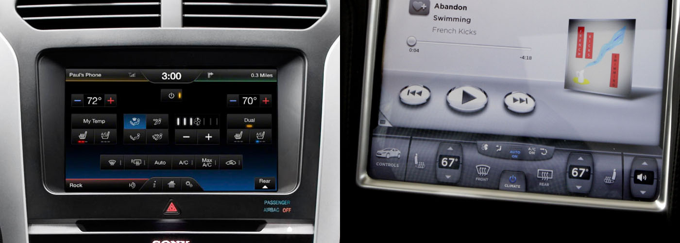
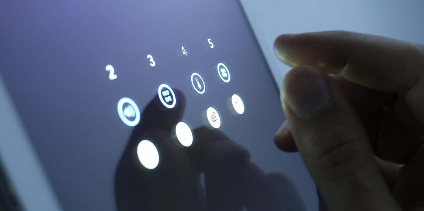